Monday, 23 May 2011

Commoner Inc.

Work by Commoner Inc.
 http://abduzeedo.com/beautiful-design-work-commoner

Fast Eddie's Barber Shop:
"Fast Eddie's is a no nonsense barber shop found in Allston, MA. one of Boston's many historical neighborhoods. This place is the epitome of traditional Americana, which I wanted the mark and typography to represent; Franklin Gothic and ATF Bodoni scanned from a letterpress book with a mashup illustration combining an iconic eagle and barber's comb.
I wanted to stay away from the "red, white & blue" barber pole theme and stick with something high contrast and modern. Stark, rich blacks screen printed on whitewash 100 lb. card stock give the collateral a strong masculine feel while referencing the brand's age and history."

The Lower Depths:"Identity for a taproom and restaurant in Kenmore square, inspired by it's port town history."

Rat City Beer Inc:
"Rat City is a boutique brewery specializing in artisanal craft beer, located in the heart of Allston, MA. The company was named as a tribute to the neighborhood it resides in, notorious for it's overwhelming rat population. Being ever optimistic, the name was a way to show local pride as well as differentiate itself from the many other brewhouses in Boston and the surrounding area.
Drawing much influence from the prohibition era, the design and copy give a nod to the classics while still remaining relevant and contemporary. The brand reflects a blue collar, D.I.Y. aesthetic that is steeped in tradition with respect for the craft of home brewing."

Taste of Ink

Some really good business card and logos:

http://tasteofink.com/gallery/business-cards/18

The Graphics Department

A website design by 'The Graphics Department', for 'Charlies Cafe Bar and Dining'. I like how the design is simple yet is clear and easy to navigate around.

Sunday, 22 May 2011

Subject/Content

John Lewis Advertisement:


Nanatsukahara Butter Cake - Designed by T-Square Design Associates
This cake uses special butter from Nanatsukahara farm, Hiroshima Prefecture. They wanted to use the package as a vehicle to communicate where the cake was made and coming from, enjoying the scenery of the farm and of course, the butter cake too:


Peace Solid - Typeface:
Inspired by psychedelic lettering of the late 1960s, originally introduced by poster artist Wes Wilson. The letters in the upper and lower case character positions curve differently, and several special 'turn characters' can be used to link between them. This typeface is driven by subject, as it is being representatitve of a certain era and the art movement of that time.
The pieces of packaging by GGRP, is driven by the subject, being music, the packaging doubles up as a protective casing and a device that allows the audience to interact and play the vinyl record, as if it is a turntable.

Adicolor - Adidas
This poster advertisement for Adidas trainers, is driven by subject as it is inviting the viewer to 'Create your Adicolor', therefore the imagery used is creative, with bold colour.

Specialisms/Skills

This beautiful handcrafted typographic piece by Yulia Brodskaya is driven by her specialsm, with her painstaking attention to detail, she uses colour card to create these fantastic pieces.


Media/Processes

Bite Me:
Bite Me is a 100% ink free package design. This is process driven design as itcis purely a play of the sense of touch, by using embossing, die cutting and laser engraving to create a mark. This could also be a way of being more sustainable.

Function/Purpose

Creative Creatures designed by Grain Creative
At Halloween, Grain Creative decided to create bottles of wine, labeled with details of their Halloween party, to send as an ivitation to their clients, to give a teaser of what was to come on the night. The invitations has humurous aspects to them, an draws influence from 50s horror films and The Rocky Horror Picture Show.
I think this piece of work is driven by the function and purpose as it is designed to be an intriguing invitation:


X-ACTO by Joy Lin

The piece of packaging is driven by the function and purpose as is is designed to be reuseable. It recognizes the users every need in terms of transport, storage, usage, and disposal. Additionally, the compartmentalized design ensures that all of your precision tools are safely and conveniently accessible.

Packaging looks as if it could have actually been cut out with an X-ACTO blade. The material is stacked B-fluted corrugated, die cut and printed using soy-based flexographic inks.


LACK Magazine (Concept)
This progressive cover concept, is driven by the function and purpose. It resembles a bag shapes using the 'dust' fold, as women have been noticed to get caught in awkward situatuions tryign to hold onto their magazine. It was also created as a way of promoting LACK Magazine as the women holdign it will be like a walking advertisement.

Calendar made of matches

Client: VS Energy International Ukraine
This calendar is driven by purpose as it was important to expose the idea of "energy", as it is predetermined by the name and logo of the company.
Each page is a month and it looks like a comb made of matches that correspond to the days.


Audience/Context

Starbuck's Frappuccino Advertisement:


Egoiste - by Madeleine Skjelland Eriksen
This packaging is driven by the audience as it was created to be appealing  to the blind, visually impaired and people with regular eye sight. It is clearly aimed at men, and the stock made out of steal underlines the masculinity and sophistication.

Billboards by Kudos:
These buildboard are clearly context driven. If they were not placed in the right place they wouldn't work, because the environment around them is as important as the design itself. In order to capture the natural aspects of their products, they used a billboard using nature itselft to represent their product.  A perfectly placed billboard that uses the sunset and moonlight to illustrate their superior hair color products and change the hair color of the billboard. Target audience- women.

Monday, 16 May 2011

Avro Ko

http://www.avroko.com/

Avro Ko create fantastic designs for interiors in restaurant, hotels, residential, retail environments.
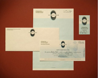
here is a selection of graphic design work, that they have created to go along with many different styles of restaurant they have worked for.
They include things such as: logos, menus, business cards, letterheads, compliments slips, bottle designs, plate designs, gift certificates, and uniforms.


Analysis of restaurant Websites

Park Avenue Season Restaurant
http://www.parkavenyc.com/

I chose to analyze this restaurant as it as easy to navigate around, and is clear and informative. It provides enough information, in the right style that is complimentary of the restaurant itself.

Navigation:
This stays at the top of each page
 About:
Talks about the restaurant environment, how you can imagine the set up, and then about the chefs. has an image of one of their dishes.
Menus:
Consists of image of the dishes. Each image you are able to click on to select different menu's including dinner, lunch, brunch, dessert and the wine list.
 The menus then are then laid out for each dish explaining what they consist of, and also the price.
Reservations:
Image of a table in the restaurant.
The first page allows you to choose your party size, the date and the time you wish to make a reservation...
 You are then directed to another page which says if that date and time is available, and then gives you the choice to change it if it isn't.
 You then are directed to another page were the customer details are needed. Including their name, phone number, email adress and special requests (if any).
After completing the reservation, an email is sent to you as confirmation.
Private Events:
This then directs you to 3 separate pages of three different rooms available for private hire. It also has a private dining enquiry page.

Photos:
It also has sub pages that each fade through images of each season on page for: 'photos', 'seasonal transitions', 'seasonal desserts', and 'seasonal interiors'
 Press:
These ar elinks to where the restaurant has been mentioned in the press.
There are also sub pages for, fact sheet, restaurant bios (chefs), openign announcement
Contact:
Consists of the address
Telephone
Fax
Location map - pin-pointing the restaurant
How to get there on the subway
Google maps link
Yahoo maps link
And also a sign up list, as a chance to receive information on upcoming events through emails.
It also has the email addresses for the general manager, private events organizer and for press inquiries.

This appears at the bottom of each page:
It has another navigation. And also has the restaurant address, phone number, website url, and copyright.


I have tried to map out the interface for this website to make it clear. And to help me when coming up with my website interface, so I have thign son the right pages and don't miss anything out.