A short Calvin and Hobbes animation using stock motion. I may have to use abit of stock motion within my title sequence and idents, as it will be hard to manipulate parts of my character, when the body is is motion.
Not really sure about the music used in this though...
I really like the character design for this game, it is simple yet looks good, and is the main focal point of the game. I like the bold colours used and the subtle shading to give a 3D element to it, however it keeps the background more 2D so it is not distracting. With the game being viewed from a side, you are able to see the size of the ski slopes and the detail of the background.
The typography for 'Disney' works because its personality represents the product perfectively. It is bold, curved, with soft fluid movement, and is fun and playful. Just like the Disney cartoons.
Bad typography:
The original typography in the logo works well for the 'Gap' Brand, the use of serif and uppercase gives a important feel to it, yet is simple and clear. The brand is for clothing, that is of good quality, basic, casual clothing and essentails.
However the new logo that they unveiled, consisting of Helvetica typeface (a common typeface used amongst graphic designers) was not as effective. This was not just because most people are identifiable with the original logo because it is so well established, but becuase the typeface does not retaint he same personality of the brand. Less to say it was scrapped.
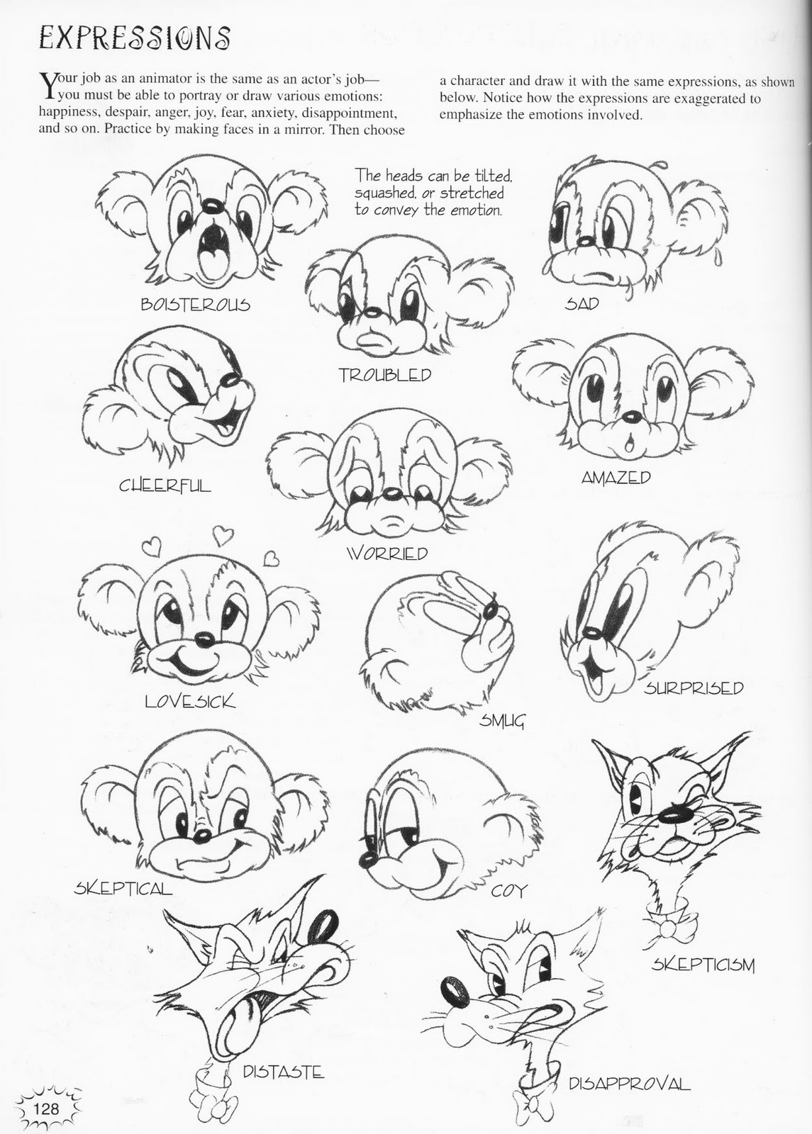
I researched into drawing cartoons characters to help me, when I draw my own. Looking at the shape of the body when in motion, expression and detailed backgrounds.
I found these funny pictures of things people make in the snow, I think things applies to my 'Top 10' brief, and has given me some inspiration for some ideas for my idents and title sequence.
Opening title sequence analysis -
I analysed the title sequence for The Powerpuff Girls' as it was one of my favourites, with its bold colour scheme and the style of imagery. There is quite alot of simplicity but it is still a catchy sequence, and I can now see how most of the frames would have been manipulated within After Effects.
I like how the voice over works with the sequence. And how different colours are used for the background. I noticed how the blue, green and pink are used as background colours from the first free scenes, as they are the colours of which the three girls wear on their clothes.
The colours then become more intense and brighter as the music starts and the fightin begins
The only credit sused in this sequence are the name of the programme 'The Powerpuff Girls'' and who it is created by.
Here are some of the main colours used within The Powerpuff Girls sequence-