http://www.behance.net/gallery/Liverpool-English-Pub/1657922
Showing posts with label Branding. Show all posts
Showing posts with label Branding. Show all posts
Monday, 28 November 2011
Monday, 31 October 2011
The Icecreamists
'The Ice Creamists' concept of boutique ice-cream is targeted towards adults, and has a very classy, upmarket feel to it.
The logo itself is quite gothic with a skull and wings, with 'Agents of Cool' as their slogan.
Her are some of their campaign imagery, which are clearly aimed at their target audience:
The logo itself is quite gothic with a skull and wings, with 'Agents of Cool' as their slogan.
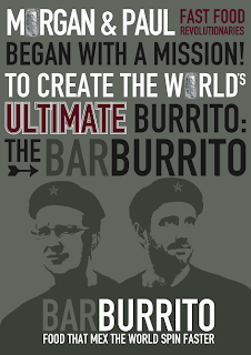
BarBurrito
The bar burrito offers the 'stations' experience like subway were you can make decisions on what you want in your burrito at different points. This is a form of interaction that can intrigue customers.
BARBURRITO has a strong brand identity that is consistent across their range. Here are some imagery from their website:
I really like the 'maths' to make the perfect burrito:
Here they exchange letters for items of food that can be chosen to top on the burrito:
Step-by-step to eating a burrito. Simple and clear:
Menu:
Imagery used for the range of salsa spiciness
Use of photography
Ice Cream Parlour
I found a really good design concept for an ice cream parlour that was consistently carried through a range of products:
http://eatdrinkchic.com/post.cfm/diy-ice-cream-parlour-make-your-own-sundaes-buffet-concept-for-wedding-or-party
http://eatdrinkchic.com/post.cfm/diy-ice-cream-parlour-make-your-own-sundaes-buffet-concept-for-wedding-or-party
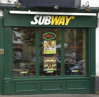
Subway
The subway logo is both recognisable and memorable of the sandwich stores. The colours used are bold and the font is legible.
Subway offers a dining experience that is a step-by-step to making your perfect sandwich. This is done in 'stations' were decisions are made by the customer at each one. This may make customers want to come back and try something different next time they come back.
Here it the subway process, it is simplistic yet effective:
Here is some branding of the stores:
And soem packaging:
Here it the subway process, it is simplistic yet effective:
Here is some branding of the stores:
And soem packaging:
Wednesday, 19 October 2011
Existing Ice Cream Parlour
Branding for Ice-Cream parlours usually have a consistency to them, that their target audience is usually families with children. There is a lot of bold colours and illustrations used within the designs to give an impression of fun and simplicity.
To gain a bespoke feel to the designs for the Ice Cream Parlour, I want to try and tackle the brief with a different tact. Obviously colour will play an important role along with type and image, but I want to create different associations and connections.
Here I have looked at a few different Ice Cream Website to get a feel for their particular brand:
Cheshire Farm Ice Cream
Home Page-
How it's made-
Cheshire Farm Illustrated Map-
Parolour Menu
London Restaurant Festive Sample Menu
Children's Menu
Frederick's Ice Cream
To gain a bespoke feel to the designs for the Ice Cream Parlour, I want to try and tackle the brief with a different tact. Obviously colour will play an important role along with type and image, but I want to create different associations and connections.
Here I have looked at a few different Ice Cream Website to get a feel for their particular brand:
Cheshire Farm Ice Cream
Home Page-
Flavours-
Interactive-How it's made-
Cheshire Farm Illustrated Map-
Mr Whippy Ice Cream
http://www.mrwhippy.co.uk/index.html
Charlottes Real Jersey Ice Cream Parolour
Ice Cream Parolour London
Parolour Menu
London Restaurant Festive Sample Menu
Children's Menu
Frederick's Ice Cream
Marble Slab:
http://www.marbleslab.com/
Cold Stone Creamery
http://www.coldstonecreamery.com/
Subscribe to:
Posts (Atom)


