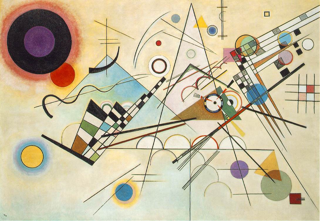
post modern/style over content/composition/contrast between black and white
Showing posts with label OUGD101. Show all posts
Monday, 23 November 2009
Helmut Krone
I like how the car works in tandem with the tagline ' Think Small'. The composition of the piece with the car loooking small in the distance over a white background is very catching.
Lissitzky
'Beat the white with the red wedge''
The line, colour, shape and form of this piece makes it a powerful image.
Guiness Advertisements
(Photographer - Toby Borrow, Art Director - Tom Hoskins)
The guiness pint is recogniseable as a dark glass with a white head. So within the advertisements this concept is manuipulated using different objects to ressemble a pint of guinness in many clever different ways.
Banksy
Banksys creates graffiti art in strategical places. His work is mostly of humourous scenarios, and are deffinately unique pieces of graffiti art.
TBWA Paris
I liek the idea for this piece of advertsing for clothes design, as they used dirty marks from the ground with simple clothing designs drawn around them. It is very humourous, clever and effective.
Kelle Rebbe
The coloured pieces from each object on the left, have been taken out and put back together to resemble another object. I think it is a very clever piece of work, that represents the 'perfect organisation' of the company that it is advertising.
Abbott Mead Vickers
I like the humour of this billboard display where the light bulb glows as somebody walks underneath it, to show they have an idea!
Nick Knight for Alexander McQueen
Again I have an image by Nick Knight, I like he digital manipulation of this image with the pin goin through the skin on her forehead and the white eye. It gives a sence of ugliness in contrast with the beauitful garment.
Tim Fishlock
I like these letterforms designed by Fishlock as they use strong, bold sapes and colour. They are readable when put together as word, however, some can be quite hard to figure out on their own.
Chris Clark
Chris Clark takes into consideration the typeface and its forms and manipulates this in fascinating ways, her is some he made with wooden cubes.
Hand Job - Book
I fing these illustrative pieces very intruiging and I think the detail used withtin them are very effective.
Sue De Beer
Again,I like the use of coloured light, from either reflectors or gels, to give a more surreal effect to the images.
Tierney gearon
I like the digital manipulation of these images and how two images with different environment are merged together, forcing a relationship between the two images.
Subscribe to:
Posts (Atom)